
You have to use images on social media if you want to succeed. There are lots of resources for finding free stock photos, but it takes more than just posting a stock photo with a few words typed over it.
Effective social media images — the images you use to promote your blog posts, share tips and quotes, and even advertise specials — should convey your brand, and have a recognizable, consistent look.
It’s actually not as complicated as it sounds. Follow these four steps to creating social media images that will make your brand stand out:
#1 Use Branding Colors
Your images should be tied together with your branding. That includes your logo and your brand’s colors.
These elements should be used in all of your graphics, and on photos, where you can add your logo, text, and other details like frames using a simple graphics program like Canva.
If you haven’t thought much about your brand’s colors, it’s a good time to start, and even revamp your brand, if necessary. The colors you use convey a lot, and will subconsciously associate you with other companies and their branding.
The Logo Company did a fascinating analysis of the psychology of color in logo design. Points of interest include:

- Red is a powerful and energetic color that excites the senses.
- Orange catches the eye and commands attention, while giving a feel of friendliness (it can also read as rebellious paired with black, as with the Harley Davidson logo).
- Yellow conveys warmth, clarity, and optimism.
- Green conveys health and nature — all-natural products and companies related to the outdoors tend to use green.
- Blue is strength and trust. While orange and yellow insinuate friendliness, blue isn’t there to be your friend, it’s there to show that reliability is the first priority — it’s common for tech and utility companies.
- Purple is imaginative and creative, with a sense of fun, all things brands like Syfy, Yahoo, and Barbie want to convey.
- Black (and grey) are no-nonsense, like The New York Times, and Wikipedia, and also convey simplicity, as with the Apple logo.
While this guide can help you to decide what color(s) are right for your brand, don’t get too hung up on the color descriptions. The yellow CAT logo says safety, not warmth, and the black Cartoon Network is more fun than no-nonsense.
Generally speaking, you should focus on one main color and maybe a secondary color — think of it like a sports team, represented by one or two colors.
Once you’ve decided on your brand’s color(s), use them on every image you create.
#2 Utilize Typography Effectively
The right font can turn a plain image into a visual work of art, but using typography effectively can be a challenge.
The biggest mistake people make when starting out with typography is using too many fonts. Stick with the golden rule on fonts, and don’t use more than two styles in one graphic.
Too many fonts looks cluttered and disjointed — but even worse, it looks unprofessional.
Find one font to use as your brand’s primary font. I use Canva a lot, so I usually use it to find fonts, then do a google search for it (if I don’t already have it installed outside of Canva) and download it. That way, you can use it in anything branded.
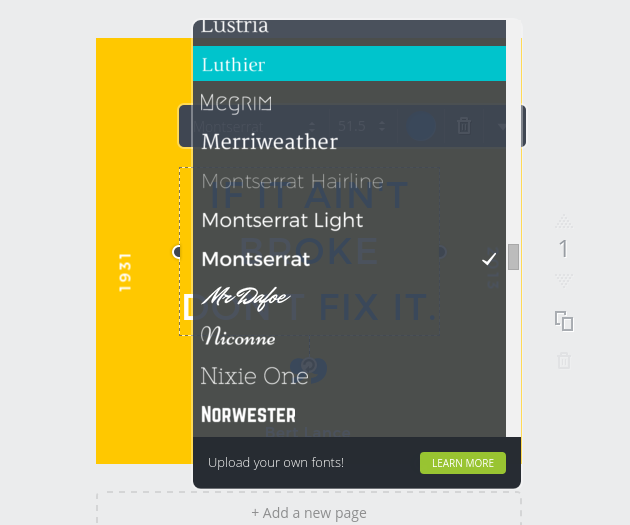
A second font should compliment the first, and, again, look to Canva. Canva’a templates are created by designers with great eyes for typography — they’re font combinations are flawless.
In general, you’ll want one more distinctive font and one more simple font.
Don’t go for super-fancy fonts like intricate scripts for branding, and avoid trite fonts like Ironwood and Comic Sans.
#3 Consistency
Using the same font on your images is one way to create brand consistency. Another is to give all of your images a similar feel.
A quick and easy way to give your images a similar feel is to choose a photo filter to use on all of your images. Filters are an option in most photo editing programs, including most smartphone editors (including Instagram), and online editors like PicMonkey.

Go for something that gives your images a more uniform look without being too extreme. Some filters make the colors pop just a little, or mute them so they take on a more pastel hue.
Consider the look that both matches your branding and communicates your business’ personality.
Avoid anything you might get tired of, or a filter that may not enhance any image, such as a sepia tone.
A desaturation filter (i.e: a filter that turns your images black and white) can have a dramatic effect, and can look great with bold branding colors — but, again, do you want every image you post to be black and white?
For some, that might be a yes, but it’s something to think about.
Not that you’re married to one filter forever. But for consistency’s sake, you should find a look you like and keep using it as part of your branding.
#4 Define Your Style
You’ve selected your colors, font(s), and filter, now bring it all together with a set design style.
Having one consistent style is not only part and parcel of good branding, it also makes creating new graphic images a snap, because you won’t have to decide on a layout.
Using a graphics tool like Canva, upload your edited image and your logo, and experiment (using your brand colors and fonts) until you’ve created a design that’s eye-catching, clear, and simple to replicate with different images and text.
Elements to define in your design include:
- Placement of your logo. It should be placed in the same spot on every image, usually in a corner of the image (see below).

- Text area. This is where you’ll put the headline (for blog post images), tip, or other text. Use a fairly long headline for the design, and check out how it looks on various types of photos.
- Accents. You might choose to use lines a frame of some kind for all of your images to give it a distinctive look. Don’t go overboard with this, but some well-placed accent can enhance the design (look at Canva’s layouts for ideas or use a free text layout).
When you’ve got a design you like, save the “static” part of the design as a single element or layer. The static part of the design is your logo and any accents or frame, if you use them.
Finally
When it’s time to create a new social media image, simply overlay the static design on your image, and add your text.
Following these steps, not only will the quality of your social media images improve, you’ll likely save time by creating essentially pre-designed, branded images.
What do you use for your images?
[hide_from accesslevel=‘free’]
Are You Ready To Start Doubling Your Business With Half The Effort?
If you have a business, whether it’s established or brand new, wouldn’t it be great to know how to use free and low priced modern marketing methods to boost the number of customers banging on your door and dramatically increase your profits? And with no technical degree, no sales staff and just a few minutes a day.
As a member of The Owners Club, you’ll get free access to the methods I used to bootstrap my company from zero to a million dollars in its first 12 months with no sales staff (it was actually $1,002,000). And the methods I’m using today to keep growing it beyond 97,000 customers with very little effort. Best of all, it’s absolutely free.
Go here to get started
[/hide_from]